B2B fintech: less bland, more brand
The fact that many start-ups look, feel and sound the same has been well documented.
In both B2B and B2C, what was once a new and fresh way of communicating has become a well-trodden path.
Whether it’s insurance (Kinsu), banking (N26), gardening (Patch), food boxes (Gousto) or air travel (Level) – there’s a shopping list of brand features that you can choose from.
Sans serif font? Check.
Pastel block colours? Yep.
Matey language? Hell yeah!
Emoji-laden emails? ?♂️

There’s a multitude of reasons why this simple, stripped back aesthetic has come about.
- Tiny screens
- The internet
- DIY start-ups
- Anti-shiny corporate sentiment
- Laser focused business propositions
Oh and don’t forget Pantone’s colour of the year for 2019 being ‘Living Coral’.
The problem is that people are starting to notice that we might have hit peak minimal.
The cosy pastel hues are just another thing to glaze over. The cute emojis begin to grate. The simple language starts to sound a little too basic.
There are a few industries where this is particularly a problem.
Fashion is one. Beauty is too. But financial services and fintech is another which is suffering from minimal burn-out.
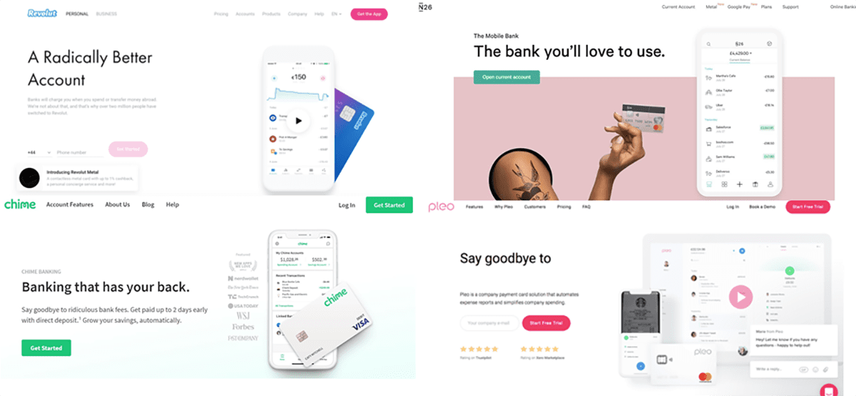
We took a cursory glance at a few of the fledgling B2B companies out there and quickly found ourselves bamboozled by the plain-ness of it all. A snapshot of successful fintech leaders is like looking at a jigsaw puzzle where the only different piece is the logo in the top left of the screen.

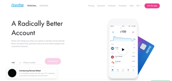
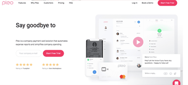
The same brand cues and formats prevail across much of the B2B fintech industry.
From a customer point of view this isn’t very useful, and it’s potentially unsustainable. The simplicity of a service isn’t always enough. One day the VC money will run out and a brand could stumble on their lack thereof.
Meanwhile, across other industries there are signs that things are changing. Design trends are moving on from an era of Ikea-inspired chic Scandi minimalism. Interior designers are swinging back to gaudy maximalism (even Ikea). So are some beauty brands.
The interesting side story to this is the traditional financial services companies whose brands are built – and surviving – on scale, reliability and heritage. In other words, trust.
Some of the oldest banks in the world, from Coutts to Barclays, trade in a very different currency to the new wave. In look and feel they have more in kin with a premium tailor or shoe maker than they do a tech start-up. The crisp suits and wood panelled walls exude a natural sense of confidence and credibility…
Trust and credibility are precisely what fintech companies have to work hardest to earn.
So, will we start to see some of these trust-inducing cues seep in to some of these B2B brands in 2019?
Will anyone be bold enough to stick their head above the parapet and not feature millennial pink on their website?
Will the serif fonts rise up to take back the throne?
I wouldn’t bank on it.

