5 principles of Information Architecture & why it matters to marketing

Humans are ‘informavores’ after all. We need information to survive.
What’s all this then?
I recently attended a day all about Information Architecture (IA) put on by Akendi. The importance to marketing teams is clear to note. A well-structured site or app can be a real differentiator for your customers, especially with eCommerce or where you have a large number of products.
IA is the structural design of shared information environments. This isn’t exclusively web sites, apps and intranets. But also, supermarkets, airports and other public spaces that need organising properly. Imagine how tedious it would be passing through an airport if the signs and notices weren’t properly labelled and organised.
But, for sites and apps, IA is all about the organisation and labelling of content to facilitate search and navigation – with the goal of making all that content usable and findable.
The consequences for a business if their site content is neither usable nor findable could be severe. Decreased customer satisfaction, decreased sales and customers seeking out a competitor are three likely outcomes.
Popular misconceptions are that IA is just wireframing, design or UX. It is linked to each of these and the lines can get blurred but IA has a process of its own which stands apart from these parts of the process.
Key principles of an IA
- In order to start with an IA, it’s important to understand how people search for information.
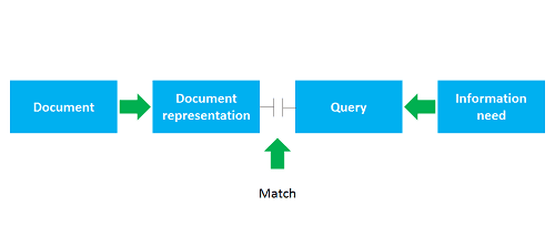
Traditional information retrieval works when a query, based on a need for information finds a match with a representation of a piece of content relevant to the query.

In order to make information as findable as possible, it needs to support all types of query. And online, there are many different ways in which users search for content, and different ways in which search engines find and index documents. Each user is different and will follow a personal path.
What is worth noting is that the commonly used “3 click theory” (people only click through 3 times to find something) isn’t really supported by any statistics.
- Obstacles to following a query to the desired content
There are a number of obstacles that stand in the way of your user finding your content in a structured and satisfactory way. Including:
- Iceberg syndrome: when you click through to a page for the answer to your query but instead you’re presented with a barrage of information. We’ve all been there.
- Unclear links: it’s common practise now to not make links look like links. Back in the day everything was underlined in colour, and much easier to spot.
- Banner blindness: there are certain places on a page where, due to users’ overexposure to banners, are no longer associated with good content. As such users tend to ignore them.
- Unclear or inconsistent naming: try not to use jargon and try to name it in a way that makes it easier for users to find.
- Orphan pages: These are pages that you can navigate to, but not away from easily (no outward links). These can be found and listed on Google but provide a less ideal experience for users.
Each has a different solution and is worth bearing in mind when planning your content.
- The relationship between users and content
To understand this relationship, you need to explore and test what kind of mental models users use to categorise the content that you have on your site – so that it is displayed in sensible, followable groups.
Testing is vital here as it can be very subjective. For example, on a groceries site all dairy products could be listed together under the same category. But you could argue that milk and cheese would fall under different categories.
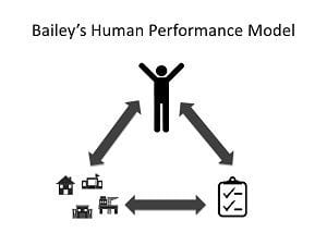
Bailey’s human performance model (below) states that at all times, someone wants to do something (list icon), somewhere (different location icons). Therefore scenarios can be designed to facilitate them achieving their goals. An information architect needs to understand who wants to do what and where.

It’s important to consider what these goals might be. In order to understand the goals, it’s important to consider:
- What are the business’s goals?
- What are the user’s goals?
- Do you know your different user personas? If so, does their persona affect their goals?
In order to help them achieve these goals an information architect can:
- Understand what content users need
- How the users think that content should be ordered
This is where testing becomes very important. The more products and categories you have (groceries example, again) the more potential opportunity you have to get lost in the navigation.
- Different techniques to categorise content
There are 2 types of process you can use to sort content into categories and they both involve taking all the different types of product and writing them onto cards (physically or electronically):
- Open card sorting – this is where there is not a pre-defined list of categories. Users organise into groupings and give each grouping a heading
- Easy to set up but hard to analyse as there can be many combinations
- Closed card sorting – align products to a pre-defined set of categories
- More difficult to set up but easier to analyse. Useful to stress test your categories.

This process can help to influence your navigation menus.
- Tools to shape and organise content
There are various tools to help shape and structure your content in a site:
- Organisational schemes (e.g. labelling, navigation, search)
- Metadata – used to describe content within the site to link it to other, broader topics
- Controlled vocabulary – key to get consistency of language used and related terms
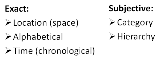
Within organisation schemes there are a handful of techniques. These follow the acronym LATCH and stand for:
- Location (for maps or statistical representations of information)
- Alphabetical (for long lists of content)
- Time (think Facebook and Twitter)
- Category (more subjective – based on what your agreed model is)
- Hierarchy (again subjective based on your agreed approach)

Whichever procedure you choose to structure your content, it’s important to test that structure with users. Without this, it is a lot like guesswork. If you’re unwilling to explore a structure with users from scratch, you could later validate your choice with testing to see whether users can find certain items when asked.
As a failsafe it’s a good idea to use a site map and even an alphabetical index (for really big sites). This has 3 benefits:
- Helps Google search and index your site
- Helps you get your head round the structure
- Allows visually impaired users to access your site
So what does this all mean for marketers?
To sum up, why is this important to marketing? IA is built on research and is a great way to understand how users see your products. Lots of companies want to have an “inward facing” (as opposed to outward facing) approach on their website, and this is a good way to achieve this and understand more about your customers.
“Success will belong to those who understand how to combine technology, strategy and structure in keeping with their unique position in the marketplace.” – Peter Morville, Information Architecture for the World Wide Web.

