5 reasons your landing page is underperforming
Landing pages for B2B campaigns suffer from an all-too-familiar set of mistakes that affect their success. Here's how to make sure your next landing page is a winner.
We often create variants for ad creative and copy in digital marketing, because we’re talking to different user types, audience segmentations, or micro variables.
This is brilliant for curating custom experiences and messaging for the right audiences. But this can lead to misalignment with content on the landing page if the landing page is not carried with those changes or variables.
“If I am mid conversation with you, and I suddenly start talking about something else, using words that aren’t coherent, the conversation is broken, you get confused, and it doesn’t always make sense.”
Being consistent in message, copy, headlines – even imagery – is vital in campaign journey planning, from ad to landing page. This ensures that any variables used in campaign creative and ad copy are still in sync with the core landing page, resulting in frictionless campaign journeys and seamless digital experiences.
3. Poor load speed
This is a bugbear of mine, but also something I appreciate is not a quick fix. Development improvements can take weeks or more. But it’s vitally important to recognise the significant impact that poor page speed can make on your UX, and the success of your landing page and campaign overall.
In a recent survey from Unbounce, 85% of landing pages in the testing pool were slower than Google’s recommendation of 5 seconds or less at a 3G connection.
That’s right – EIGHTY FIVE PERCENT!!
Added to this, 59% of people won’t wait more than 4-6 seconds for a website page to load before giving up, with 70% of consumers saying page speed directly influences their decision to buy.
Page speed matters. Don’t ignore it.
4. Conversion flow mistakes
There are some fundamental things not to do when looking for campaign conversion. One of the major ones is asking too much of your prospects.
Imagine the scene:
- You’re having a coffee, and the server asks, “Would you like to join our loyalty programme?”
- “Sure”, you say, expecting to be given a flyer with the relevant details or a QR code to sign up.
- Instead, they hand you a clipboard with a pen and two double-sided pages of A4 with 20 questions on each side, instructing you to fill them in and leave none blank.
- When you finish your coffee and leave, the clipboarded pages remain untouched at your table.
Regardless of how much data you actually need to get a user into your system, or for you to get everything you want from them – they don’t have time and they don’t care. They just want to see, play, download, or get ‘inside’ to see what it’s all about for themselves. So let them, by not asking for everything and their dog’s name on their first visit.
(I’ve also seen the exact opposite, where a landing page for ticket sales was beautiful but not converting. Why? no price options on display next to the ticket details, and no actual CTA button to purchase tickets and enter the flow. Sometimes it’s the obvious things.)
5. Your landing page isn’t a landing page
It’s all too easy to use a pre-existing page on your website as the campaign landing page. Heck, even the homepage could do the job, right?
No. It will not.
As I explained in point 1 above, a landing page works best when it has a single focus and minimal distractions. This is why I’d argue you should never send people to a homepage from a campaign, but I’ve often seen this when a client has felt that it’s the best place to give users “the best access and knowledge of all we do”.
I would throw that out too.
Your landing page should:
- Have one focal point and not try to be ‘multi-purpose’.
- Be brief and direct, without too much content, multiple signposts, or confusing messaging.
- Add value by building on the story that brought the user to it.
- Have one main conversion option (subsidiary ones are fine as long as they don’t distract from your main goal).
So, in conclusion…
Take control by understanding what your users are doing (or could be doing) at every step of the campaign journey, and make better landing pages by making sure they’re focussed, load fast, and continue to build on the story you want to tell your page visitors.
And any time you feel like you’d like a little extra help with yours, feel free to drop us a line.
You are a B2B company with a new campaign, and your agency gets the creative concept absolutely bang on brief.
The media is extremely well curated and planned, and the ad copy and creative from your agency are second to none.
But the landing page? That’s something your internal team can probably handle. You have resource and have done this before. No problem, all good, and we all love a bit of collaboration…
To be absolutely clear – I’m not delivering some ‘holier than thou’ agency vs client scenario. I’m highlighting the importance of curating and executing the overarching digital experience for your customers and clients. Your campaign could be s**t hot, but when the user gets to the landing page, no one is converting, no one engages, and the experience falls off a cliff.
Here are my 5 top traps that landing pages fall into:
- Lack of focus
- Inconsistent with ad copy or creative
- Poor load speed
- Conversion flow mistakes
- Your landing page isn’t a landing page
And here’s what each of those means and how to fix them:
1. Lack of focus
A landing page is exactly that: where you land a key message, give focus to the action you want the user to take, and lead them to that point.
Far too many landing pages try to achieve too many things at once, they have too much content added in and links off to multiple different parts of the site.
Landing pages need to have a single point of focus, with all page content providing additional value and punch to that focal point.
What good looks like:
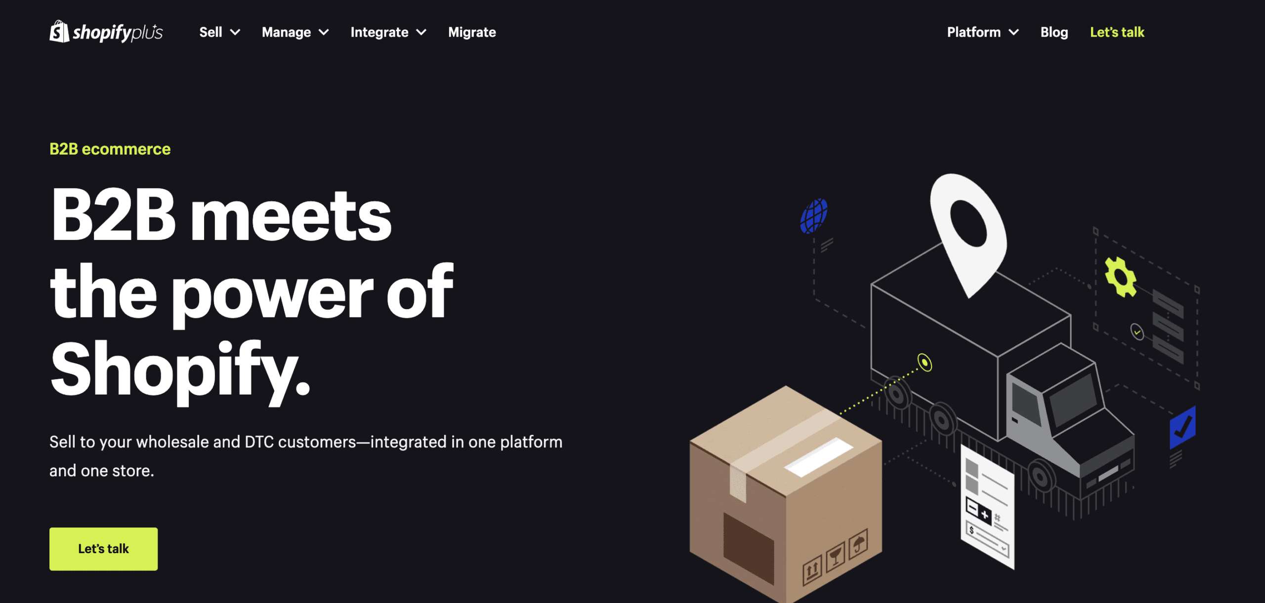 Shopify B2B landing page
- focussed main message in hero + CTA for enquiry
- the message is further validated with a video explainer
- features explainer
- testimonials
- more features
- more testimonials
What could be improved?
There’s only one CTA in the hero and one right at the bottom of the page, which is a different colour style. These should all be consistent and have at least one more interspersed in the content.
Whilst the content is all rich and focussed on the same purpose, there’s also a lot of content. I’d recommend reducing for a CRO campaign focus.
2. Inconsistency with ad copy or creative
We often create variants for ad creative and copy in digital marketing, because we’re talking to different user types, audience segmentations, or micro variables.
This is brilliant for curating custom experiences and messaging for the right audiences. But this can lead to misalignment with content on the landing page if the landing page is not carried with those changes or variables.
“If I am mid conversation with you, and I suddenly start talking about something else, using words that aren’t coherent, the conversation is broken, you get confused, and it doesn’t always make sense.”
Being consistent in message, copy, headlines – even imagery – is vital in campaign journey planning, from ad to landing page. This ensures that any variables used in campaign creative and ad copy are still in sync with the core landing page, resulting in frictionless campaign journeys and seamless digital experiences.
3. Poor load speed
This is a bugbear of mine, but also something I appreciate is not a quick fix. Development improvements can take weeks or more. But it’s vitally important to recognise the significant impact that poor page speed can make on your UX, and the success of your landing page and campaign overall.
In a recent survey from Unbounce, 85% of landing pages in the testing pool were slower than Google’s recommendation of 5 seconds or less at a 3G connection.
That’s right – EIGHTY FIVE PERCENT!!
Added to this, 59% of people won’t wait more than 4-6 seconds for a website page to load before giving up, with 70% of consumers saying page speed directly influences their decision to buy.
Page speed matters. Don’t ignore it.
4. Conversion flow mistakes
There are some fundamental things not to do when looking for campaign conversion. One of the major ones is asking too much of your prospects.
Imagine the scene:
- You’re having a coffee, and the server asks, “Would you like to join our loyalty programme?”
- “Sure”, you say, expecting to be given a flyer with the relevant details or a QR code to sign up.
- Instead, they hand you a clipboard with a pen and two double-sided pages of A4 with 20 questions on each side, instructing you to fill them in and leave none blank.
- When you finish your coffee and leave, the clipboarded pages remain untouched at your table.
Regardless of how much data you actually need to get a user into your system, or for you to get everything you want from them – they don’t have time and they don’t care. They just want to see, play, download, or get ‘inside’ to see what it’s all about for themselves. So let them, by not asking for everything and their dog’s name on their first visit.
(I’ve also seen the exact opposite, where a landing page for ticket sales was beautiful but not converting. Why? no price options on display next to the ticket details, and no actual CTA button to purchase tickets and enter the flow. Sometimes it’s the obvious things.)
5. Your landing page isn’t a landing page
It’s all too easy to use a pre-existing page on your website as the campaign landing page. Heck, even the homepage could do the job, right?
No. It will not.
As I explained in point 1 above, a landing page works best when it has a single focus and minimal distractions. This is why I’d argue you should never send people to a homepage from a campaign, but I’ve often seen this when a client has felt that it’s the best place to give users “the best access and knowledge of all we do”.
I would throw that out too.
Your landing page should:
- Have one focal point and not try to be ‘multi-purpose’.
- Be brief and direct, without too much content, multiple signposts, or confusing messaging.
- Add value by building on the story that brought the user to it.
- Have one main conversion option (subsidiary ones are fine as long as they don’t distract from your main goal).
So, in conclusion…
Take control by understanding what your users are doing (or could be doing) at every step of the campaign journey, and make better landing pages by making sure they’re focussed, load fast, and continue to build on the story you want to tell your page visitors.
And any time you feel like you’d like a little extra help with yours, feel free to drop us a line.