“Just make us look like Monzo, yeah?”

I have a degree of sympathy for both Halifax and Rufus Leonard this week.
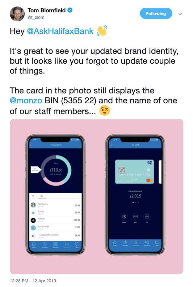
You might have seen this:
***
[Header photo: Braydon Anderson on Unsplash]
That’s right, it’s the CEO of Monzo personally, awkwardly, master-class-in-passive-aggressively calling out Halifax for their new app design ‘borrowing heavily’ from Monzo.
I can imagine how this happened. This design was never meant to be seen the harsh, unforgiving light of the endlessly nit-picky Twittersphere. Creative work for pitching or selling in ideas can be long, expensive and arduous (ask anyone on round 14 of design amends how they feel). This is doubly true when the work in question is dev focused.
Creating a working prototype to convince a client of an idea or execution is a lot (A LOT) harder than hitting CTRL+C, CTRL+V, changing some colours and showing the client some thinking that ‘makes them look like Monzo’.
Someone was a bit lazy – the design was most likely meant to illustrate thinking – and it’s bitten everyone involved in the backside.
I say I have a degree of sympathy because creative and design work is hard and expensive and time-consuming, and sometimes you cutting corners really doesn’t matter – until it does. Which is where my sympathy runs out.
In 2019 you should assume any work you make could end up in front of the wrong audience. The internet is scalable, permanent and devoid of context, so once something’s out of the box, you can’t argue it back in. If you make anything (even vaguely) creative for a living, don’t copy/paste other people’s work. It’s not what you’re paid for.
But this stuff is all secondary, there’s a bigger issue here that, far from eliciting sympathy, points to something bigger, weirder and harder to remedy:
Why does Halifax need to look or feel anything like Monzo?
One is a
So, why does one want to look and sound like the other?
Increasingly, we are living in an age of verisimilitude, wherein: The appearance of being true or real is more important than being true or real.But as the old saying goes: you can put lipstick on a pig, but it’s still a pig.
Monzo’s great innovation is being a bank that’s genuinely built around the needs of its customers. By including customers in decisions about the way it delivers services (note I’m saying services and not financial products here) Monzo offers a genuine alternative to the way that mainstream retail banks have been operating for years.
A really sad side note to all of this is that, until 1997, Halifax used to be
This is what happens when you lose sight of reality. When verisimilitude is treated as being more important tha reality. (Hey, I’m well aware there are a multitude of reasons for the systems failure of 2008 – but I’m not smart enough to work them into this rant).
Anyway.
Sure, Monzo looks really nice, has a great app, a lovely
To be honest, I don’t really care about the accidental copy & paste kerfuffle with the
What is less than forgivable, to my mind, is being told to put lipstick on a pig and calling it a challenger bank.
***
[Header photo: Braydon Anderson on Unsplash]